Focal Magazine
Most consumers read magazines to find out more about something in their cultural realm. However, this information can be altered, changed, or displayed in a perspective that most viewers will connect with. The magazine, “focal,” will create an atmosphere where the perception of our world will meet the reality of another person’s world through the expression of thought and artistic forms. Like a camera, the focal length essentially determines the clarity of the photograph. Focal acknowledges that every human sees the world differently and the magazine will attempt to provide as much clarity as possible for both reader and artist.
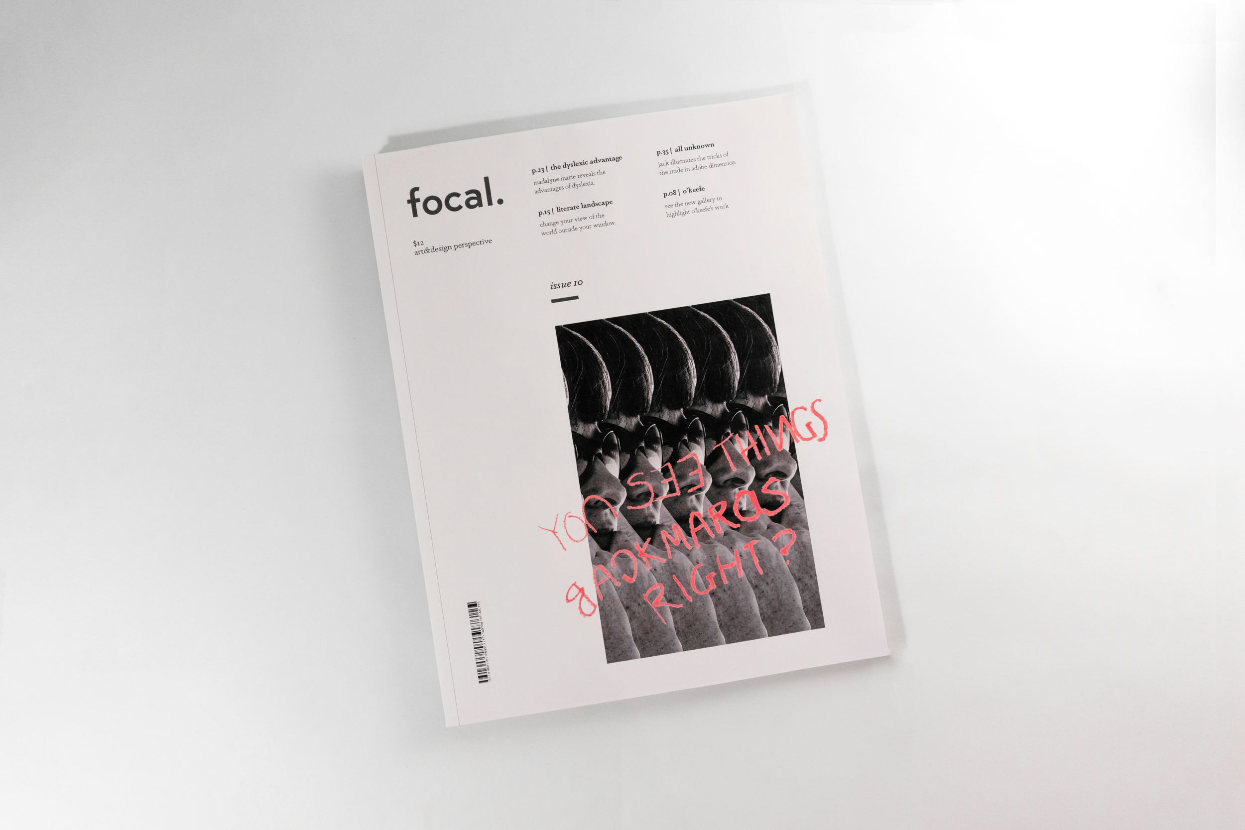
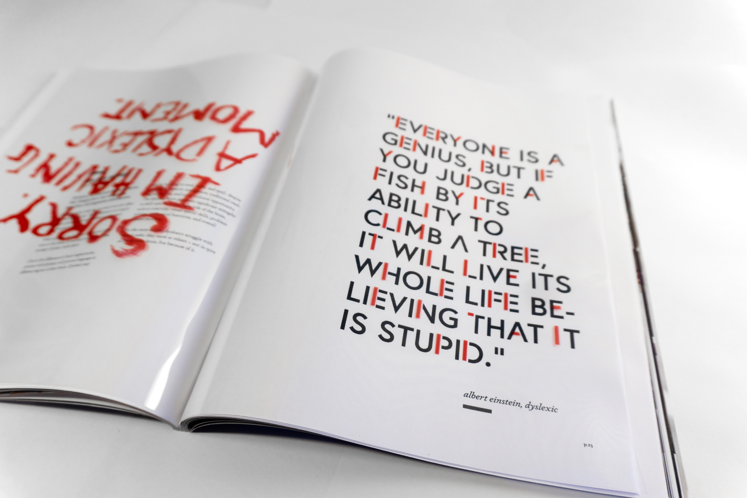
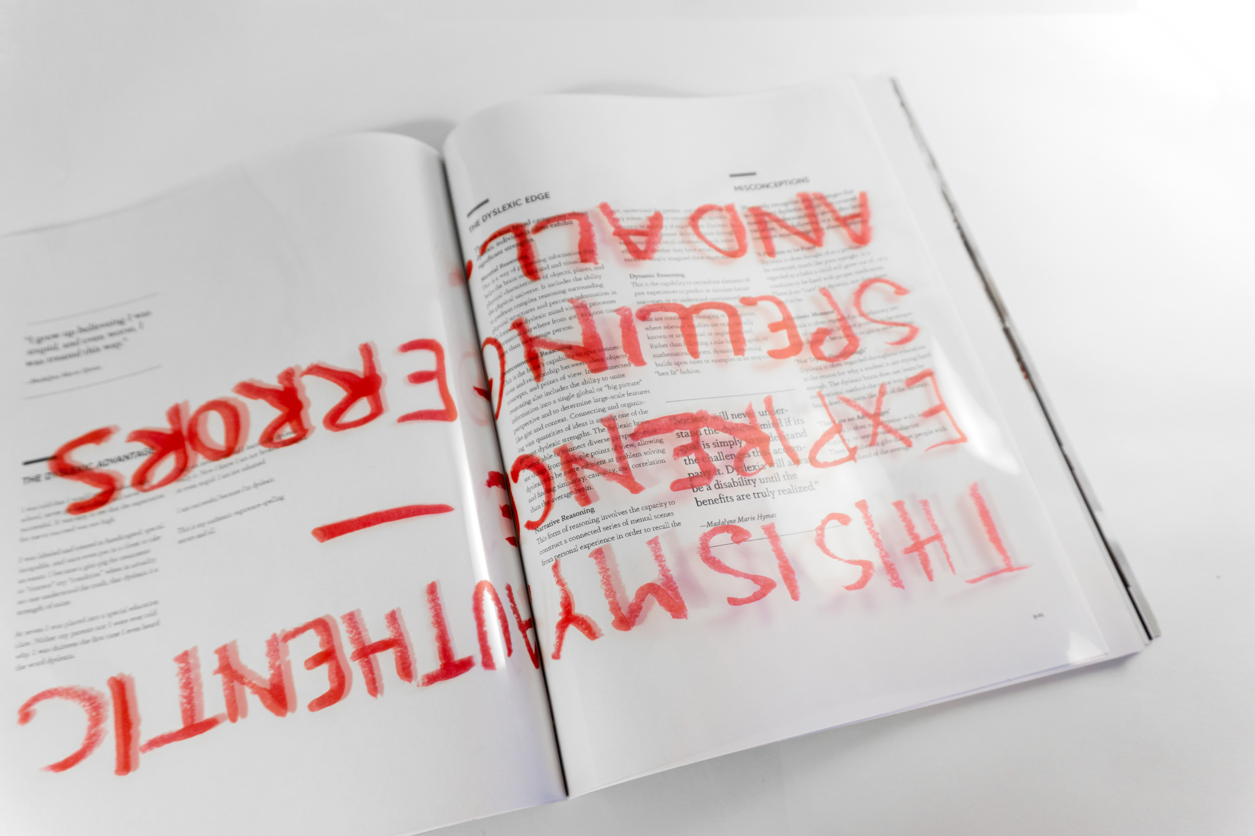
For this issue, the imagery, type and image alterations, and nameplate are original pieces. The feature spread highlights an article focusing on the experience of dyslexics. As such, the magazine used melted crayon to write the feelings of dyslexics in RED or to replace parts of the black type, printed on a transparency film, and overlaid on the spreads. The spreads are also “upside down” while reading through the magazine, making the user interact more with the magazine to read and have a hint at the challenges that may arise for a person with dyslexia. All text alterations provide a varying effect similar to how the type may be altered when viewed with a dyslexic eye.
Category
Branding, Editorial, Type & Image, Typography