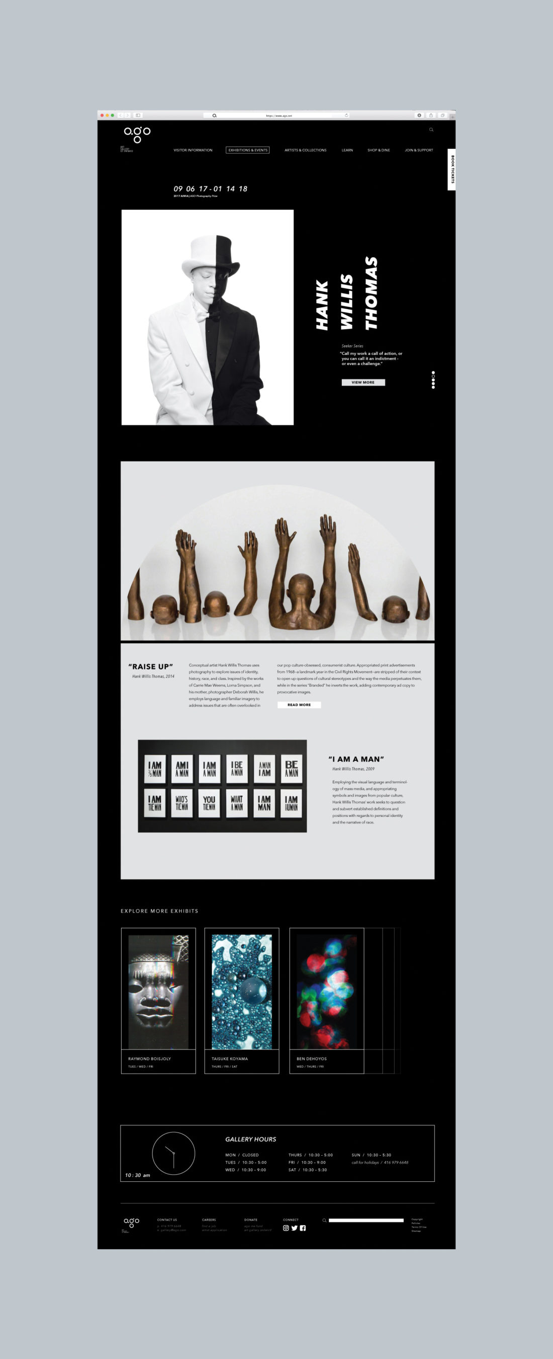
Art Gallery of Ontario
Brand Identity Redesign
The Art Gallery of Ontario provides an environment where people can visualize and interact with many forms of art to understand the world in new ways. The museum continues to be one of the largest museums in North America and stands as an imaginative center for their city and province in Canada. As such, the museum strives to influence and be influenced by the surrounding culture. The prominent influence of AGO in the community requires a developed branding presence that is fluid in all aspects.
In order to achieve this, inspiration for the brand was identified from researching the renowned architectural structures of Frank Gehry that are evident throughout the museum. The process began by looking at the initial gestural sketches of Frank Gehry for some of the AGO gallery spaces. These sketches consisted of black and white organic lines that hinted at the movement of people, art, and workers that would ensue inside of the museum. Gehry’s gallery spaces were examined such as the “Galleria Italia” and the “AGO staircase.” These galleries highlighted the use of a simple line to create a central space where people are invited to share and generate ideas.
Another avenue of research that was valued was understanding the core values and mission of AGO. The museum desires to be considered the center of the city, community, and a major icon throughout the world. The museum is mindful to respect all visitors and artists, regardless of race, artwork, and any other social factors. A continual relationship is paramount to the success of AGO, artists, and visitors both now and in the future. This is developed by the communion that takes place between the art and viewers in the gallery spaces, such as those developed by Frank Gehry.
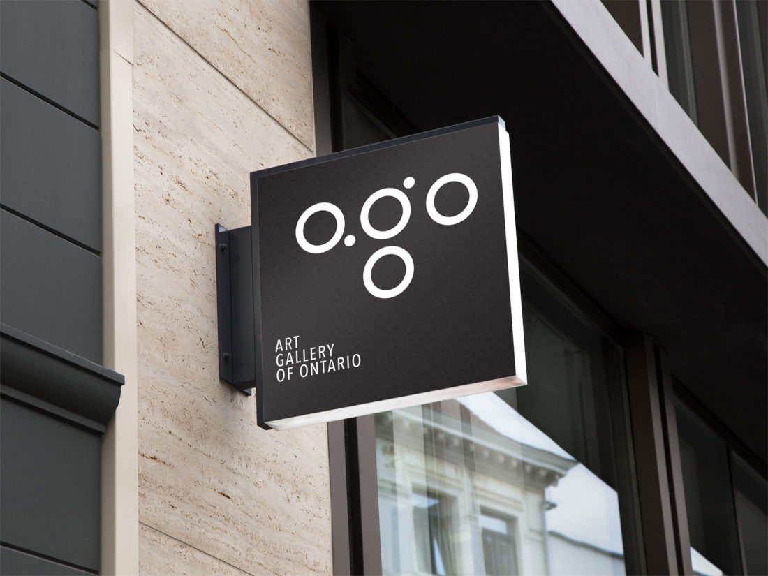
These ideas and values resulted in incorporating the idea of starting from something simple that is not tainted or extreme, but rather relatable and visually easy to understand. A central design was desired that could represent multiple meanings and ideas, just like those found in the museum. The color palette of black and white made the branding design straightforward and relates to the value of AGO advocating as a respecter of all persons.
The timeless shape of a circle simplified the look of the logo and provokes a shape that is identifiable to all viewers, whether they are in the community or visiting from all over the world. The use of a circle also corresponds to the values of being the center, or focal point of the province and community. The circles may invoke thoughts of gallery spaces, or the desire to have a continual influence into the future; a museum that is well-rounded and never-ending.
Category
Branding