Kaitlyn Cook Design | Kapel Wine
76
wp-singular,portfolio_page-template-default,single,single-portfolio_page,postid-76,wp-theme-stockholm,wp-child-theme-stockholm-child,ajax_fade,page_not_loaded,,select-child-theme-ver-1.0.0,select-theme-ver-4.4,menu-animation-line-through,wpb-js-composer js-comp-ver-5.4.7,vc_responsive

Kapel Wine

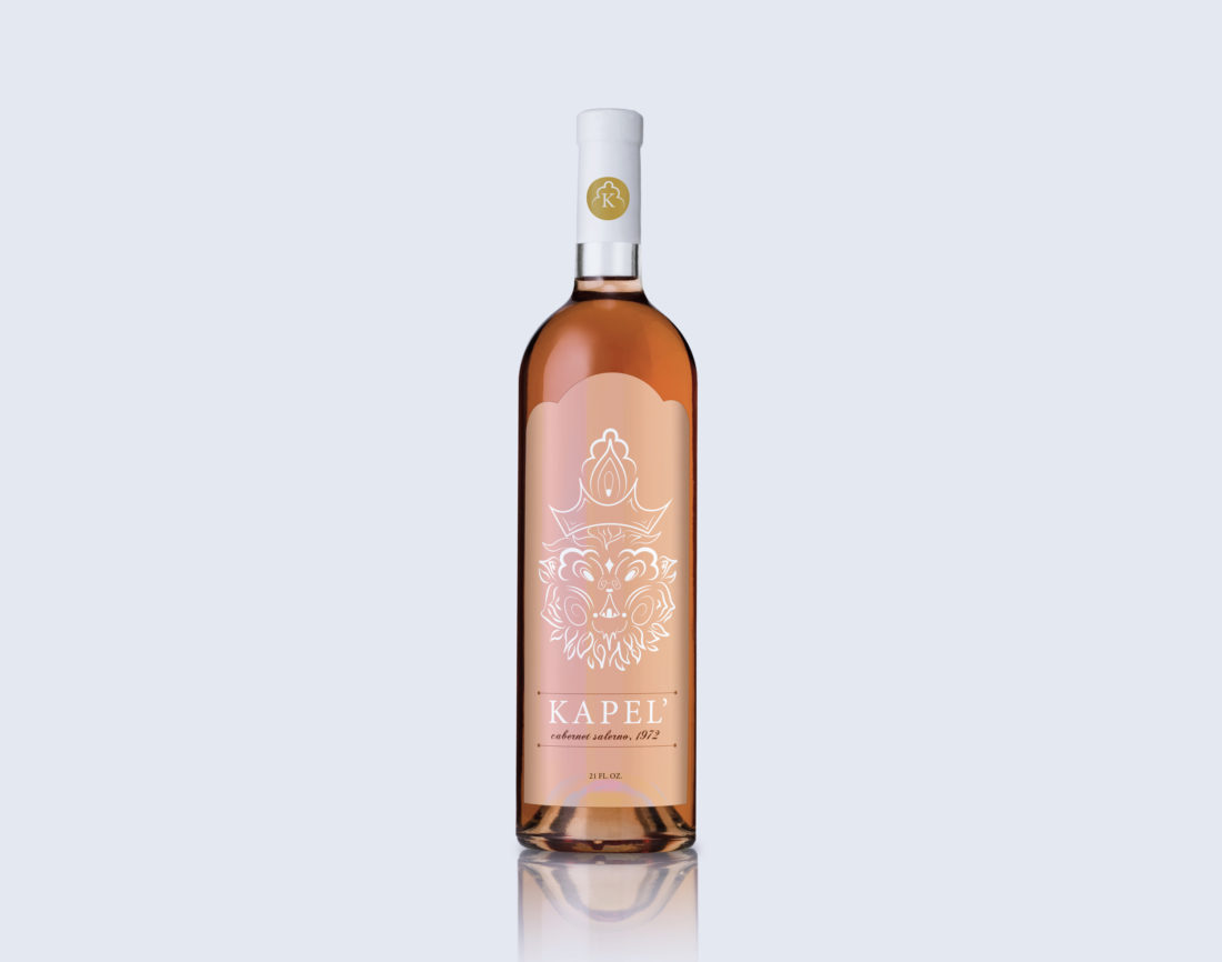
The execution of the emblem design highlights the brand integrity of KAPEL’ through the abstract illustration of a lions’ facial features. The wine bottle emblem can be changed to various color options which relate to the contents of the bottle.

Category

Branding, Emblem Design